Wednesday, April 23, 2014

Updated Personal Logo

This past week, my assignment was to recreate my personal logo from the beginning of the year. The purpose of this project is to show growth in creativity, skills in the Adobe Suites, the design process, and grow as a graphic designer. Below are the two logos I created in August. I like the simplicity, and people can identify me with the initials incorporated into them.
This is the mood board I chose to develop for my updated logo. I envisioned something bright and colorful, unlike my older logo that only used two colors. I did not want my name to be in the logo, but instead I wanted people to identify my logo through a symbol. I was inspired by animals to translate my personality through their natural behaviors, and what perfect combination of color and personality than a chameleon!?
My sketches were thought through with a sense of changing color. I varied which parts of the body I would use between the eye, the head and tongue, or the whole body. Color blocking was recently a popular trend in clothing design, and I wanted a way to incorporate that into logo design. That is where the idea sparked to divide the chameleon into sections, and by changing the color of each section, I was creating a sense of color blocking.

 I chose the chameleon because it represents change. It can change its body colors to adapt to whatever environment as a form of camouflage and protection against predators, or change its body colors to reflect the mood the chameleon is feeling in 20 seconds. The different sections represent the different parts of my life because I am constantly growing and trying new things. Originally I had a rainbow color scheme, but I decided to alter the color pallet slightly to a more pastel and girly tone. I love the bright colors because it reminds me of warmth. They are free-spirited colors. The chameleon can look in two different directions at once, and like myself, I am always multi-tasking! Chameleons are a very unique reptile because their tongues are two times the length of their body. Chameleons are super stealth because they don't have ears, but they aren't deaf. They can detect the sound frequencies and have ultraviolet vision, as well as normal vision! The chameleon is the perfect symbol of myself because they are independent right after birth. I am very independent, and sometimes I like to be on my own, but I will always have a family like the chameleon. This new logo represents my evolution.

Wednesday, April 16, 2014

Kerning

The term kerning refers to adjusting the space between letters. If letters in a typeface are spaced too uniformly, they make a pattern that doesn’t look uniform enough. Even though it may not be exactly correct, it looks correct and appealing to the naked eye. Gaps occur around letters that for outward angles or frame an open space. Kerning is usually done with letters in headlines and larger text, typically not body text. I put my kerning skills to the test using http://type.method.ac !


Monday, April 7, 2014

eMagine Media Festival


Last Saturday, April 5, eCommunication held their annual eMagine Media Festival event. Students in the area submit their work into different subcategories under Video, Animation, Graphic Design, and Web Design. I enjoyed volunteering and attending this event because it was a great source for inspiration. I was inspired to continue my education in Graphic and Web Design, and gave me ideas for elements that I might be able to include in future projects. Supporting my fellow eComm students as many received awards for their magnificent work was a great feeling. Everyone worked very hard to make the production a wonderful success. I am eager to see how we continue to improve as a program to make next year's bigger and better! The eMagine Media Festival was a great opportunity to show how talented our students are. Below I am photographed with Soloman Shields before entering the auditorium for the show!

Wednesday, April 2, 2014

Behind the Google Logo

Sergey Brin created the Google logo in 1998. He used the free graphics program GIMP. The Google logo uses primary colors, but the pattern does not go in order because, “Google doesn’t follow the rules.” The first three colors are blue, red, and yellow, which are the primary colors. However, computer software uses red, green, and blue color scales, which are the next three colors in the logo. Google uses the font Catull for its logo.  The creators of the Google logo wanted something simple, without symbols and bulky letters, so that it would be more versatile. The Logo is constantly changing for all types of occasions. The name Google comes from the mathematical term “googol” which is the number 1 followed by 100 zeros. It reflects the mission to create a seemingly infinite amount of information on the web. The image below is Google's latest update to the infamous logo. Simple, memorable, and timeless.


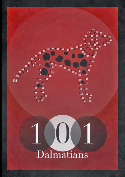
101 Dalmatians Movie Poster


Inspired by the work of Saul Bass, I recreated the movie poster of 101 Dalmatians. Bass recreates old movie titles into a new contemporary version. Each poster tells an understory, uses minimal colors, and minimal objects.


I developed two of my own versions of the 101 Dalmatians movie poster. It was completed using black, white, reds, yellows, and blue. The understory of my posters was told by using multiple elements. The dog collars hanging from Cruella de Vil's hands and from the title represent the absence of the parents in the movie. In the movie, the parent dogs are separated from their 101 pups by Cruella de Vil. She wants to kid nap the puppies for their fur pattern, as shown in her coat, and the dog-shaped spots that make up the numbers 101. The poster has a contemporary feel created by the abstract look of black and white color blocking of Cruella's hair and the background, also the shapes and lines that create her body. The box around the title, and font was purposefully added for a modern and thought provoking feel. The font is very unique and allows black and white to come though.

Tuesday, April 1, 2014

Responsive Web Design


Responsive web design is the art of crafting websites to provide an optimal viewing experience. It includes easy reading and navigation with a minimum of resizing and scrolling. The design and development respond based on the user’s screen size, platform, and orientation. 

With all of modern day technology, there are many screen sizes and resolutions. Creating a website version for each resolution and new device would be impossible. Using a responsive web design is a way for web designers to create a site that is applicable to all devices.

Media queries are added in a separate CSS, and present the content of the site tailored to a specific range of devices without having to change the content itself. Media queries allow web designers to target specific screen sizes. It pulls different style declarations from stylesheets based on the current window width of the viewing device.

Break points are browser widths that have a media query declaration to change the layout once the browser is within the declared range. On average, every responsive web design has a minimum of two break points. Break points are the points when the content of the site responds to provide the user with the best layout.

An example site that uses Responsive Web Design is Dean Oakley, a web designer from Gold Coast, Australia:
http://deanoakley.com


As you adjust the size of the webpage of Dean Oakley’s site from narrow to medium width, you will notice that the headline font will increase in size, as well as the image of the rocks and the bird. An additional navigation bar is added at the bottom of the narrow viewing window so as people read to the bottom of the page; they don’t have to scroll back up to the top navigation bar.


As you go from a medium to a wide viewing window, you will notice that the image changes completely to one that stretches the full width of the page. There is a slight color change and gradient added, and the navigation bar is now vertical. The headline is placed into a band at the top of the page. A sliding bar of posts has been added.