Wednesday, September 23, 2015

Personal Project Review

Homecoming is right around the corner, and as e-Communication students, we were approached to create a poster for the dance. The client expressed the importance of conveying the theme "Trick of the Lights" as well as color scheme (black, white, and maybe a hint of red). This piece needed to be visually appealing and easy to read for a student passing by in the halls.

With quick deadlines and turnaround time, it was important to stay on schedule and follow a strict process. I benefitted from working on my personal laptop because I was able to work from home as well as in class. Pre-production began right after meeting with the client. The client provided a Pinterest board in which I took notes on the style and feel, in order to convey a similar depiction in my work. I also looked for other similar Pinterest boards, key word searched the internet, and browsed through Bechance for ideas. I took all of these ideas and grouped them into different concepts. This then lead to twenty completely different sketches. The process of sketching allowed me to stretch my creativity a lot further than I'd ever imagined. From there, I choose two of my best sketches and took to the computer. Immediately I knew which project I wanted to push. It didn't take long for me to put together my design, however, every time I printed I ended up back on the computer making edits. This process of refinery was also very helpful thanks to feedback from my peers. It was such a good feeling to finally send it off to print. It was an even better feeling to cut and mount my work neatly on display for the client.


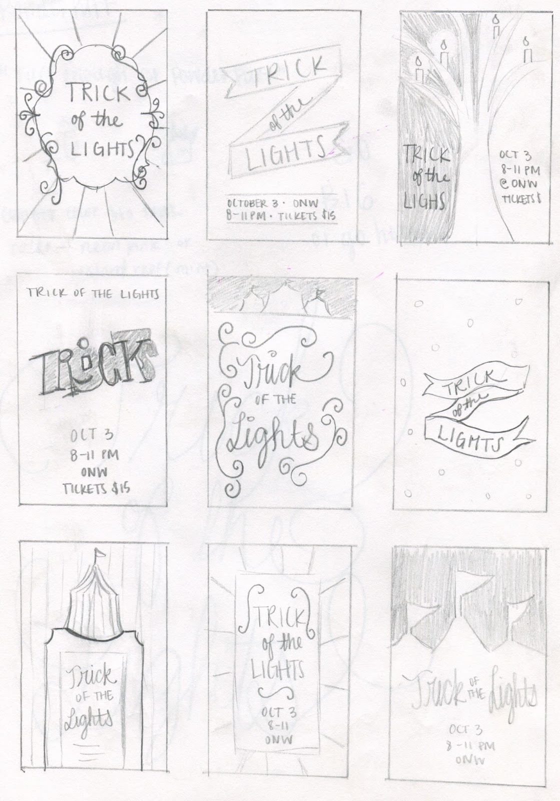


Along the way, I learned a new process of design. I had never sketched so many different ideas for one project. And along each step of the process, I received feedback from my peers. I learned how to manage tight deadlines by working on a schedule (and the importance of sticking to it). As far as technology goes, I learned the importance of using full black which is 100% key, compared to the registration black that uses a combination of CMYK and ultimately increases the cost of printing.

If there were one thing that I could do differently, it would be to find a way to implement a little touch of red into my design. After seeing the work my teammates were putting out, the pieces with even the slightest red stood out a lot more from the rest.

If there were one thing that I could do the same, it would be to take my time on cutting and mounting. This is such a vital step in the process of presenting the final piece to the client. Even the slightest uneven or jagged edge could make your project unappealing.


Before this project, I would have gone straight to the computer and designed the first thing that came to mind. However, I'm glad that I was forced to sketch multiple ideas, and I will continue to implement that step in my process in the future.

Overall, I selfishly wish this project wasn't a class project because at the end, the client only chose one poster out of twenty. Mine sadly wasn't chosen, but that will hopefully encourage me to push myself on future projects.

Tuesday, May 19, 2015

Graphic Design: Resume / Identity Package / Online Portfolio


To conclude my year as a junior in graphic design, I've put together an identity package that can be viewed on my Behance account (see link below). I have a wide variety in my color pallet because I love all of the bright colors, and I felt that it would be very useful to have choices when it came to the layout of various applications such as t-shirt, business cards, stationary, etc. I have a three-font package so that depending on the type of logo used, the fonts apply. A script, brush stroke, and serif font were chosen because of their contrast with each other. It's preferable that either the script or brush stroke always be paired with the serif unless under a special circumstance. I love the feminism, classiness, and cleanliness of my fonts. I've created three different logos: one complex, one simplified, and one elongated. The circular and rectangular brush stroke are both offset by a simplistic shape because its symbolic of my personality. There's a part of me that loves to be creative and color outside the lines, but the other half loves perfection and simplicity and structure. 

Visit my Behance profile to see some of my projects!

https://www.behance.net/jessicarichards1022


Friday, May 1, 2015

GEAR: The Final Frontier

Introduction

              As students in the e-Communication program, we thought it would be beneficial to get to know a local company located in Lenexa, GEAR.  This company designs and mass produces apparel and media for big name brands that they have bought-out such as Champion, Under Armor, and GEAR for Sports. Their projects ship worldwide. While on our tour, we visited different divisions of the company and saw the employees in action.

Experience/Tour

              Our tour of the building began in the printing warehouse. Dozens of high-tech printing machines, ovens, packaging stations, and storage. The organization of the whole process of printing shows the company's dedication to organization and success. We were shown the production of the apparel templates, which was carried out in a dark room in order to preserve the slates. Then we went into a room with a very large printer that could print different sizes, paper types, staple, bind, hole punch, etc. I couldn't help but think how amazing it would be to have one of those in our classroom. Next we visited one of the most interesting and important part of the building, the graphic design department. It's a huge space arranged into groups of cubicles according to company and another group for the designers who put together catalogs and other media. They have trending boards as areas for sources of inspiration, and areas to critique and converse. The reason they are set up into teams is to keep branding unique to each company/brand. The department had very dim lighting and it was calm-- no music. According to a poll taken by GEAR, the designers described this as an ideal environment to meet their tight deadlines.

Conclusion

              GEAR was my favorite field trips of this school year because apparel design is my favorite part of graphic design. I was inspired specifically by the graphic design department's attention to detail such as printing mediums, always pushing the boundaries in order to stay on top of trends. It's hard to even wrap my mind around the fact that we saw only a very small scope of the company.


Monday, March 9, 2015

Design Challenge


I was asked to create a graduation party invitation for a couple of friends of mine, so I decided to use elements from my design challenge in my project. I LOVE invitations, especially how in today's society many people opt to go with online "e-vites". I hope to create more invitations as graduation rolls around the corner! My goal was to create something that would look well on screen, as well as printed. I chose to make it a 5x7 for printing purposes. As you can see, I pulled elements from the three pieces above:
  • Blocking of the text and enclosing it with lines from source 1, 2, and 3
  • Dual font pairing with the alternation of bolds and italics from source 1
  • Use of one color from source 2 and 3
  • Bordering dominant photo from source 2
  • Layout using one dominant photo from source 2


Tuesday, February 17, 2015

Polygonal Design

A polygon is defined as a closed path or circuit which is made by joining line segments. In a polygon, each line segment intersects exactly two other line segments. (Below is the 'Violin and Jug' of 1910 by Georges Braque)


Artist: The collage you see here is the work Charis Tsevis, an award winning visual designer from Athens, Greece. His client list includes companies such as Nike, PepsiCo, Toyota and IKEA. His work has been featured in many books, magazines and websites around the world. This series of illustrations was created for the Turkey 2010 Basketball World Championships


Modern application: Polygons are popular in the digital world. They can impart your image or text in a unique 3D, retro style. Initially, polygon graphics were used for creating 3D models and scenes in videogames because of their render speed, which was achieved due to low polygonal resolution.


Historical application: Polygon design has had a historical precedent in art since the beginning of the 20th century. It was the time of multiple expressionist movements emersion. The advent of photography influenced this art tendency as well. Since photographs could capture an exact image the need for accuracy in art seized its topicality.


Here is the work of Marcel Duchamp on the left, and Francis M. Naumann on the right. Historically, polygons were used commonly used in video games for wire frame illustrations.


Tutorial

1. Download application.mac OS X from server


2. Open/install TriangulateImage5OSX app


3. Select "Choose an Image". Image must be a JPEG.


4. Make sure that you're on the O or "original layer"
5. Use cursor to place points along the edge of the object. The more dots, the more accurate. 


6. If needed, select the "ON/OFF Eraser" or (E) to remove any points placed incorrectly.
7. (M) or "Mesh" allows you to see the triangles and the original image simultaneously, where you can add points if needed.


8. When you're finished, choose (R) or "Result" to see the final product.


9. To save work, select "Write to PDF" and save the file to your computer!


Tuesday, January 20, 2015

Strengths-Based Leadership

Top five leadership strengths:

1. Achiever (Executing)
2. Restorative (Executing)
3. Competition (Influencing)
4. Strategic (Strategic Thinking)
5. Focus (Executing)

Achiever:

This describes my drive and constant need to accomplish things. Every day has an agenda, and if the goals aren't met, I feel as if my day is incomplete. It helps bring me the energy I need to work long and hard hours on projects. It also is the source of my productivity. In groups, I am good at creating reasonable goals and making sure team members meet deadlines and produce sufficient work. Achieve is defined "to bring to a successful end; carry through; accomplish".

Restorative:

This describes my ability to solve problems/ come up with better solutions and ways to do things. I enjoy fixing things so that they can work again. I also find this problem solving trait arise in design, when I find all of the errors and find ways to tweak them. In groups, this would be my constant checking to make sure the team isn't headed for failure. Restorative is defined as "capable of renewing health or strength".


Competition:

This describes my constant comparing myself to others, in both the physical and intellectual sense. Even if I reach my goal, I always feel the need to be the best, be on top, and outperform my peers. It is also true that I like to participate when I feel I have a good shot at producing the best outcome, and avoid contests where winning seems unlikely. I always feel like when people ask me, "What did you get on the test?" I have to have a higher score. That's why I study and work so hard in school. Competition is defined as "the act of competing for some prize, honor, or advantage".


Strategic:

This describes my ability to sort through clutter and find the best route. It is a distinct way of thinking. It's a perspective that allows me to see patterns and play out alternative scenarios. This is my productivity, and a little of creating lists. I wouldn't say it's daydreaming, but I constantly find myself out of focus and running through dozens of different scenarios even though half of them aren't even plausible. Strategic is defined as "pertaining to, characterized by, important in, or essential to the nature of strategy".


Focus:

This describes my ability to set and reach my goals. My focus forces me to filter and prioritize what gets done in what order, and decide how it will help me reach my goal. The downside to my focus is that I quickly become impatient with delays, obstacles and tangents. I keep my team members on track by reminding them that if something is not helping us move toward the destination, then it is not important. I can study for hours on end if needed to. Focus is defined as "a central point, as of attraction, attention, or activity".

Reflection:

I found that learning the importance of knowing and using my strengths to my abilities, versus trying to build strengths where I may be lacking, was most valuable from the activity of Friday with Mrs. Knight. I had an "Aha!" moment during the presentation when she noted that people with my traits tend to make lists. I make lists 24/7. I love lists and once she said that, it all made sense to me. Now that I am able to recognize my strengths, I think it will allow me to find a better position for myself in group projects. I think it would be best suited for me to take a position such as project management, where I can oversee the entire project to make sure things are on time, following guidelines, people are working together, the client is happy, and we are achieving goals we set for ourselves along the way.


Tuesday, December 16, 2014

What is Graphic Design?

    The first representations of graphic design can be seen as far back as cave paintings and tomb wall drawings of ancient civilizations such as the Egyptians. Graphic design is art with a purpose. The visual communication and expression of concepts and ideas is produced through various elements. It can be found everywhere: logos, websites, business cards, advertisements, book design, brochures, billboards, product packaging, posters, magazines newspapers, greeting cards! 


    The design process:

1. RESEARCH
    *set goals and context of the project
    *client background, product evaluation, gather info, context analysis

2. VISUALIZE
    *create a market strategy
    *creative brief, conceptual development, information architecture, market strategy

3. DESIGN
    *create the look and feel of the project
    *design sketches, design evaluation, client discussion, design interaction

4. CREATE
    *create the final product of the project
    *create prototype, finalize design, production, launch campaign 


    Above is the shirt design I've created for the final project. I chose this quote from Da Vinci because of its direct correlation to graphic design. This past month, I have learned the importance of having confidence in your work, and having the ability to "defend" or justify your work to clients. An important aspect of design is also being able to keep up with changes and trends, produce work based on what you've heard, seen or felt, and using your opinions to contribute to your work. 
    As a way to keep up with trends, I use Pinterest for my inspiration. I've been working on several projects lately for different clients, and I find it most useful to look at sorority/fraternity event shirts. The vibrant colors, attention to detail, and creativity really appeal to me. I saw a floral wreath on another shirt, a decided to make my own. The font compliments the floral theme, and I think it would look lovely printed on the back of a t-shirt.
    I enjoy graphic design because it develops my creative abilities. There is always something new to learn or observe. It challenges me to keep up with trends in design, and often work on tight deadlines. There aren't many boundaries with graphic design. I can draw inspiration from just about anywhere, and transfer ideas to sketches, onto a computer, and manipulate the Adobe programs in order to achieve the desired effect. After discovering the world of graphic design, I can't go anywhere without noticing it.